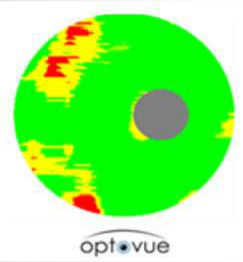
Significance Map Explanation
A Significance Map is provided that shows the regions on the Deviation Map where the percent loss is statistically significant. The Significance Map shows normal areas as green, borderline areas as yellow, and outside normal areas as red (see figure below). These are based on probability values of p < 5% for borderline, and p < 1% for outside normal.

The Significance Map shows
regions in the Deviation Map
that are statistically significant.


